
The new Premier League season is just around the corner and excitement is well and truly building ahead of what promises to be another thrilling campaign.
The summer break affords clubs the perfect opportunity for transition, whether that be replacing players or coaches, or transforming their on-pitch presence by designing a sleek new kit – an extremely important aspect of the modern game.
With all 20 of next season’s shirts now released to the public, I’ve ranked my top 5 – based solely off personal opinion. Let’s take a closer look, shall we?
5. Newcastle (home)
After decades spent apart from adidas, Newcastle have rejoined forces with the German goliaths in a mega-money deal that will see them don the iconic three stripes for the next five seasons and be worth a reported £200m.
As always, the famous black and white stripes have been adhered to but – just like that kit from the early-noughties – they come in a thicker format to add a certain boldness which has been lacking in recent seasons. Difficult not to think of the great Nolberto Solano upon taking a single glance of this striking new number, or former internet provider ntl: (see below for reference).
4. Tottenham (away)
Tottenham rarely get their kits wrong, but one thing that they could potentially be critisied for is a lack of imagination. Whilst the simplistic white/navy colourway and sleek design on this season’s new home shirt gets a thumbs up from myself, a little more pzazz would perhaps offer a different dynamic to the north Londoners’ offering this season – and that is exactly what has been implemented on their funky new away shirt.
The centrally-positioned crest looks as cool as you like sat proudly upon a light-wash blue backdrop, affording the famous Nike swoosh more freedom to dominate the top of the jersey, while the yellow and white accents on the base of the sleeves add a hint of vintage tradition. Nice work.
3. West Ham (home)
While it is adidas who have dominated this list, Umbro and West Ham nestle themselves in a respectable third place here with a sensational retro-inspired kit for 2024/25. A claret and blue colourway provides huge potential where kits are concerned and the Hammers have certainly not missed with this one.
Inspired by the club’s historic Cup Winners Cup-winning kit from 1860 – where the Irons beat TSV Hamburg at Wembley – this season’s shirt is packed full of nostalgia as well as being effortless on the eye. If you took the branding off, it could easily pass as a top made by Fred Perry, providing a more leisurely aesthetic as well as giving a subtle nod to the club’s proud British heritage.
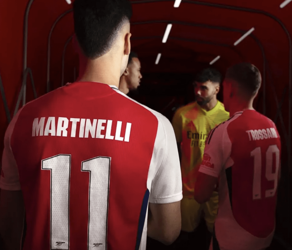
2. Arsenal (home and away)
Arsenal are not just one of the heaviest hitters on the pitch, but their merchandising is also always to a platinum standard. Since partnering with adidas back in 2019, the Gunners have released a series of five-star collaborations. From showstopping Jamaican-inspired warm-up tops to remakes of the iconic bruised banana kit from the 90s, Arsenal’s kit designers truly are masters of their craft.
That is further proven by both of their new kits for the upcoming 2024/25 season, where the traditional home shirt has been given a facelift with a prominent navy trim for added allure, and the away shirt pays homage to the club’s strong links to West Africa with a unique zebra-patterned accent teaming up beautifully with green and red stripes to frame a simply stunning shirt. Collaborating with Soho-based West African fashion brand Labrum, the Gunners’ have created yet another top-notch kit here – one which they will likely don on Gameweek 2 when they travel to the West Midlands to face Aston Villa; keep your eyes peeled.
1. Aston Villa (home)
Here is then, drumroll please… my personal favourite this season – Aston Villa’s new home strip. Just like West Ham, the Villans have utilised the beauty of a claret and blue colourway to perfection in their debut season with adidas, and while it might not have all the bells and whistles of some of the other tops in this list, the simplistic, clean cut design gives it a really classy edge.
The three stripes of claret trickling down each of the sky blue sleeves marries up perfectly with the thinner stripes which hug the round-neck collar, while the retro-inspired new crest – created ahead of 2024/25 – sits with pride parallel to the iconic sporting brand’s logo. With Champions League football returning to Villa Park this term, the club have certainly created a shirt befitting the prestigious competition. Bravo.
Share this article

Related news
Consetetur sadipscing elitr, sed diam nonumy eirmod.


